
[This project was completed 2023. We just have been so busy with clients we neglected our own marketing and never posted this blog post. We’re getting better, we promise.]
In the competitive ready-to-drink (RTD) beverage market, brand identity can make or break a product’s success. This case study explores how our strategic approach to brand positioning and design helped transform an innovative concept into a compelling brand ready to disrupt the market.
Phase One: Launching the Vision
The Initial Challenge
When the founder of Megalodon and good friend, Bill Dessel, approached our branding agency, he brought a revolutionary idea: create a large-format RTD spirit-based beverage that would shake up the market. His vision was clear – deliver convenience with a shock factor that had never been seen before in the category. However, to bring this vision to life, he needed to secure investors and build a strong team quickly. This meant creating a brand identity that could tell a powerful story and capture investor attention.
The Quick-Strike Strategy
Understanding the time-sensitive nature of the project, we focused on developing three crucial elements:
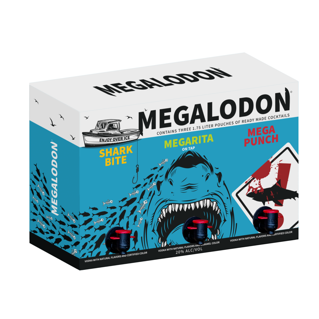
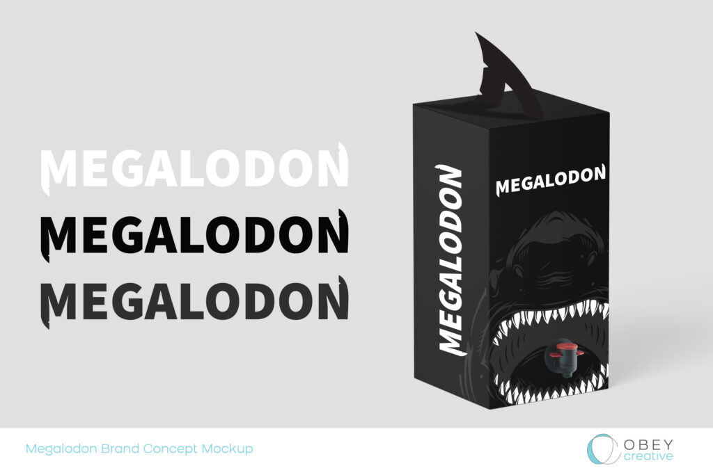
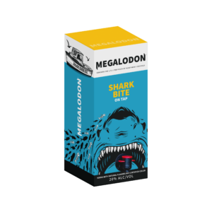
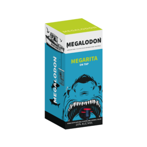
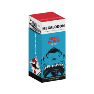
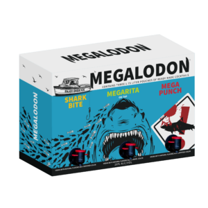
- Logo Development We created a striking logo that captured the bold, disruptive nature of the brand while maintaining premium appeal. The Megalodon name – referencing the largest predator to ever exist – provided rich creative territory for developing a memorable visual identity.
- Package Design Concepts Our team developed initial packaging concepts that would stand out on shelf and communicate the product’s unique value proposition. The design needed to balance impact with sophistication, ensuring the large format wouldn’t compromise the premium positioning.
- 3D Product Visualization To help investors clearly see the potential, we created detailed 3D mockups of the product. These visualizations brought the concept to life, demonstrating how the innovative format would look in real-world situations.
Investor Success
Armed with these brand identity elements and a compelling pitch deck we helped create, Bill successfully secured investor interest and raised an initial seed round. This success validated our strategic approach to the brand’s visual identity and positioning.
Phase Two: Deepening the Brand Strategy
Market Research and Target Audience Analysis
With funding secured, we conducted focused market research to refine the brand strategy. Our research centered on the target demographic: young adults aged 21-30 who embrace an active social lifestyle, including:
- Beach outings and outdoor activities
- Tailgating and sporting events
- Social gatherings and parties
This research provided crucial insights that would inform our brand positioning and design decisions.
Evolving the Brand Identity
Based on our research findings, we evolved the brand identity to better resonate with the target audience:
- Color Strategy We introduced a vibrant, energetic color palette that would appeal to our young adult target market while standing out in the RTD category. Each color was carefully selected to:
- Create strong shelf presence
- Differentiate flavor varieties
- Convey the brand’s bold personality
- Maintain premium positioning
- Flavor Development Working closely with the client, we helped select and position three launch flavors that would:
- Appeal to target demographic preferences
- Create a cohesive product family
- Offer unique selling propositions within the category
- Package Design Refinement The final package design was crafted to:
- Maximize impact at point of sale
- Clearly communicate product benefits
- Create Instagram-worthy moments
- Function effectively in various usage occasions
Phase Three: Technical Excellence
Collaborative Implementation
The final phase of the project required meticulous attention to detail and close collaboration with multiple stakeholders. Our team worked hand-in-hand with:
- Co-packer Coordination We partnered with the co-packing team to ensure all design elements would translate effectively to the production environment. This included:
- Adjusting artwork for different printing processes
- Ensuring color consistency across materials
- Optimizing design elements for manufacturing efficiency
- Regulatory Compliance Our team navigated the complex requirements of TTB (Alcohol and Tobacco Tax and Trade Bureau) regulations, ensuring all packaging elements met strict guidelines while maintaining design integrity. This included:
- Proper placement of required information
- Accurate alcohol content display
- Compliant health warning statement placement
- Technical Specifications We managed all technical aspects of the packaging implementation:
- Barcode generation and placement
- Print-ready file preparation
- Color specifications for consistent reproduction
- Quality control processes
The Impact
The resulting brand identity system successfully positioned Megalodon as a disruptive force in the RTD category. Through careful attention to both creative and technical requirements, we delivered:
- A distinctive brand identity that resonates with the target audience
- Packaging that commands attention at point of sale
- A scalable design system that can accommodate future growth
- Production-ready assets that meet all regulatory requirements

A Foundation for Growth
The importance of branding in business cannot be overstated, particularly in competitive categories like RTD beverages. Our strategic approach to Megalodon’s brand identity and positioning helped transform an innovative concept into a market-ready reality. From securing initial funding to launching a distinctive product line, each phase of the brand development process contributed to building a strong foundation for future success.
Want to learn how strategic branding can help bring your beverage concept to life? Let’s discuss how we can help position your product for success in today’s competitive market.